
Overview
Attend Anywhere's caller entry is the first thing a patient sees before every video consultation, a text message, a link, and a handful of screens standing between them and their clinician. It's a small journey by page count, but not by consequence. If someone gets stuck on it, they don't just lose a few minutes, they risk missing the appointment entirely.
I led the design response to a set of usability problems that had built up in this journey over time: cookie and system banners crowding the limited mobile viewport, a details form that fought the keyboard, and privacy messaging nobody was reading. I audited the existing journey screen by screen, validated what I found through moderated usability testing, and designed a front end first fix that could ship without waiting on a larger platform rebuild.
The problem
Working through the existing journey on mobile, the same handful of issues kept showing up on screen after screen.
Cookie and "we're testing your setup" banners ate into the little viewport a phone has to offer, before a caller had even seen anything useful.
Screens rendered mid scroll on navigation instead of resetting to the top.
The details form took repeated scrolling to get through.
Privacy Policy link sat there, unread, next to a form asking people for their personal details.

Checking it against real users
Before spending design time on fixes, I ran moderated usability testing on the existing journey with six participants, a spread of ages from 26 to 58, Android and iOS devices, and digital confidence ranging from low to high. Each one completed six task based scenarios that mirrored the real appointment flow, from opening the invite link through to entering the waiting area.
Six participants is a standard sample for this kind of study, enough to surface the majority of usability problems without the cost of a much larger one. The point wasn't to prove myself right, it was to confirm what was actually happening when a real person tried to get through this journey under a five minute deadline.
Finding
Result
Completed the journey without needing assistance
6 / 6
Scrolled repeatedly to complete a four field form
5 / 6
Paused after the keyboard dismissed, searching for Continue
4 / 6
Opened the Privacy Policy before entering their details
1 / 6
Average ease rating (SEQ)
5.3 / 7
Average confidence rating
4.3 / 5
Average time on task
3m 14s
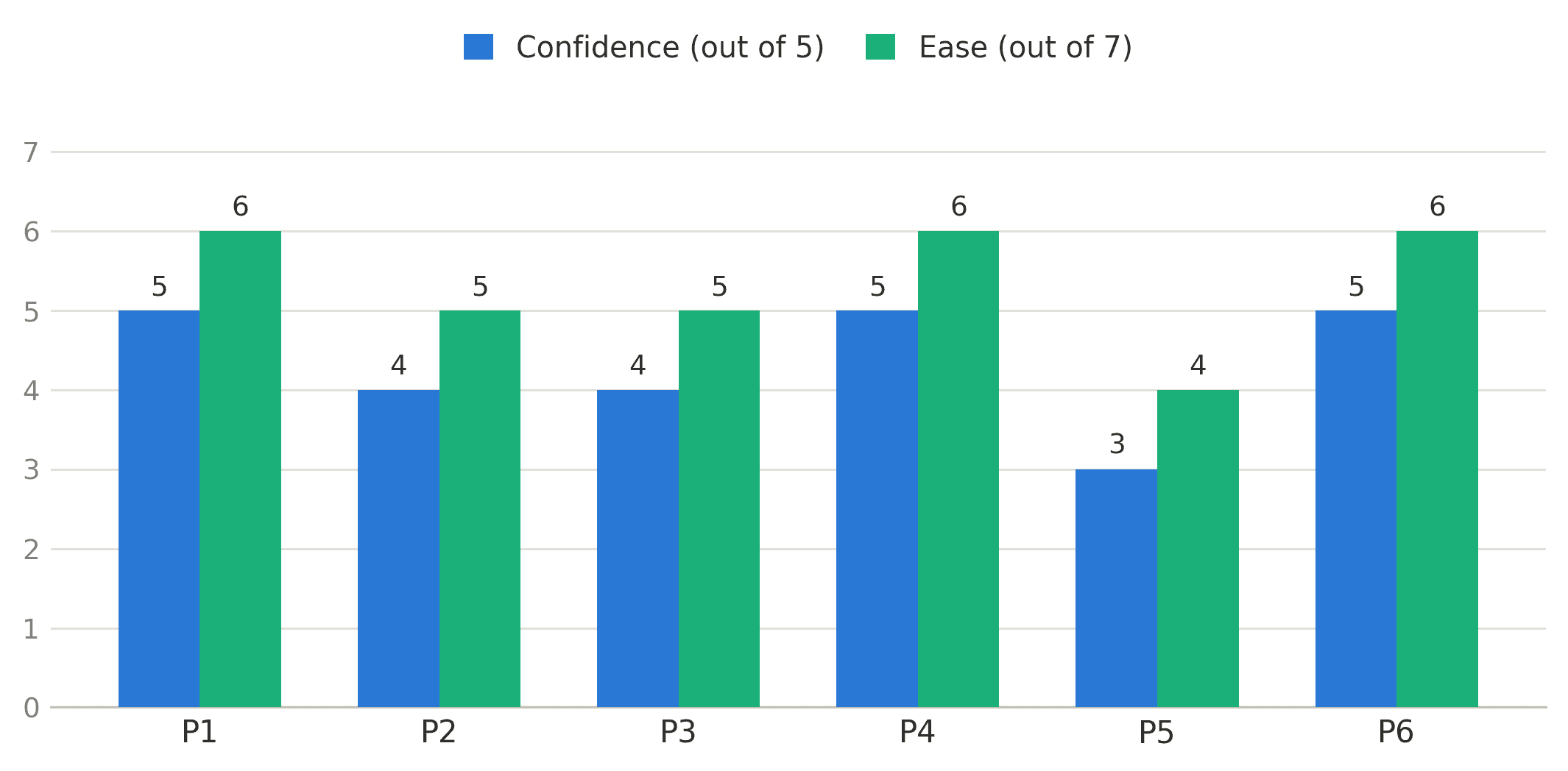
Everyone completed the journey, but with real friction along the way, which is its own kind of finding. The most interesting thing testing surfaced wasn't even on my list of known issues. One participant never opened the Privacy Policy, but reasoned their information was secure simply because the appointment was with an NHS service. People weren't reading the privacy messaging, they were substituting an assumption for it. That reframed the fix. The answer wasn't a more visible link, it was moving the reassurance into the form itself, where someone's actually looking when it matters.
The redesign
The response stayed deliberately front end. No new fields, no backend changes, no dependency on the additional caller fields planned for a later phase. The goal was a set of changes that could ship fast and remove the friction testing had just confirmed.
Getting people through to their appointment, faster
Every screen now loads scrolled to the top, and the cookie and "we're testing your setup" banners were restyled and made non sticky, freeing up meaningfully more of the mobile viewport for the caller's actual details.

Fixing the scroll
Scrolling was named as its own essential change rather than treated as a side effect of everything else, because it was the strongest single finding from testing. Five of six participants scrolling more than they should have to, four of six losing the Continue button behind the keyboard.

Trust, without the extra tap
Instead of relying on a Privacy Policy link that testing showed almost nobody opens, the redesign places a short, inline reassurance directly inside the Caller details form, visible at the exact point someone's being asked to hand over personal information, not buried behind a link they'll never click.
One layout, every device
The same corrected journey, banner styling, onload scroll position, form layout, was validated end to end across mobile portrait and landscape, tablet portrait and landscape, and desktop, so the fix works everywhere, not just on the one device it was designed on.

Where this stands
The redesign was signed off by NHS stakeholders as the direction for the caller entry journey. I moved on from the role shortly after, so the moderated testing needed to confirm the friction actually dropped, the natural next step after the baseline research above, wasn't something I got to run myself.
What's here is the full trail: the assessment of the existing journey, the validated research behind it, and a redesign scoped and ready for delivery.