
Summary
MySites was the backbone booking engine behind two major travel brands, Peterpans and Backpacker World Travel, aggregating live and non-live inventory from dozens of independent tour and activity operators across Australia. On paper that was the platform's strength, one system, thousands of products. In practice it meant every operator's fare structure, availability model and pickup logic bled into the consumer facing booking screens. Across the product catalogue, 34% of fare types carried no PAX specific value at all, and another 66% carried one that didn't map cleanly to a traveller type.
Both brands ran on the same booking path, same layout, same screens, same underlying model, just a different lick of paint. A quick note on the images through this case study: the research was carried out against Peterpans' live site, since that's where I could pull real, dated evidence of customers hitting these problems. The UI work carries Backpacker World Travel's branding given an Executive need.
I was brought in to find out why customers were dropping out of the booking flow before completing a purchase, and to redesign the path from product page to cart. What started as a UI review turned into something more structural. The interface wasn't failing because it looked dated, it was failing because it was asking customers to solve an inventory modelling problem instead of making a simple travel decision.

The starting point
I ran a full audit of the live booking experience on Peterpans, screen by screen, product by product, across nine real scenarios pulled directly from the live site. Multiple daily departures, adult/child/family combinations, concession pricing, pickup dependent costs, live versus non-live availability, and products where "upgrades" were sometimes baked into the fare and sometimes sold as an add on. Backpacker World Travel was running the identical booking path underneath its own branding, so every issue documented here applied equally to both. I documented each with screenshots and annotated issues rather than opinions. What a customer would actually see, click, and get confused by.

A pattern emerged almost immediately. No two products booked the same way. A customer who'd just booked a harbour bridge climb using one interaction model would land on a Great Barrier Reef tour and be presented with an entirely different one. There was no single "MySites booking experience," there were as many booking experiences as there were ways operators had configured their products.
Reframing the problem
The obvious read was "the fare grid looks old, let's restyle it." I didn't think that was the real problem. Digging into why the grid felt confusing, the root cause was structural, not visual:
FareTypes were being used to model several different business concepts, a departure time, an age category, a pickup location, a concession rate, an upgrade, but the interface treated every single FareType as an equivalent, standalone customer choice.
Pickup location is a clear example. On the Tully River rafting product, three pickup points weren't handled as one choice inside a single booking option. They were modelled as three entirely separate bookable products: Mission Beach with Cairns Transfer at $199, Departs Cairns at $199, Departs Mission Beach at $169. Same tour, same day, same experience. The only thing actually changing is where the bus picks the traveller up, and the customer has to read three near identical rows to work that out for themselves.

That same logic, models every variable as its own FareType, showed up again once a booking reached the cart. On the Sydney Harbour Bridge Climb, a customer working through different time slots ended up with three separate line items sitting in their cart, each with its own quantity field, rather than one booking they could review at a glance.

Where customers were actually getting stuck
I isolated two distinct points of friction rather than treating the whole flow as one undifferentiated problem, because they needed different fixes.
1. Check Availability to Add to Cart
This was the primary bottleneck. The existing grid asked customers to simultaneously work out which date was available, which row was their experience, whether similar looking rows were duplicates, whether Select added the item immediately, whether quantity meant people or products, and how to undo a mistake if they got it wrong. Availability, arguably the single most decision critical fact on the page, was often buried in a tooltip rather than shown as a visible state.
2. Cart to completed checkout
Even once a customer had assembled the right combination of FareTypes, the retained model split their single booking into several cart line items, then asked for pickup and dietary details against each one individually, duplicating effort for a decision the customer had already made.

The redesign
Rather than skin the existing grid, I rebuilt the interaction model from first principles and tested it against the same nine real world scenarios I'd audited. The guiding question changed from "which FareTypes do you need to combine?" to:
"When do you want to travel, what experience do you want, and who's travelling?"
That gave a consistent sequence for every product, regardless of the underlying supplier data:
Preferred or open date
Relevant options and availability for that date
One selected option
Traveller quantities within that option
One Add to Cart action
One coherent line item in the cart
I separated concepts that had previously been fused together in the data model but shown as one flat choice to the customer. Date from option, option from traveller category, traveller category from quantity, live booking from enquiry only, and, critically, product selection from pickup logistics.
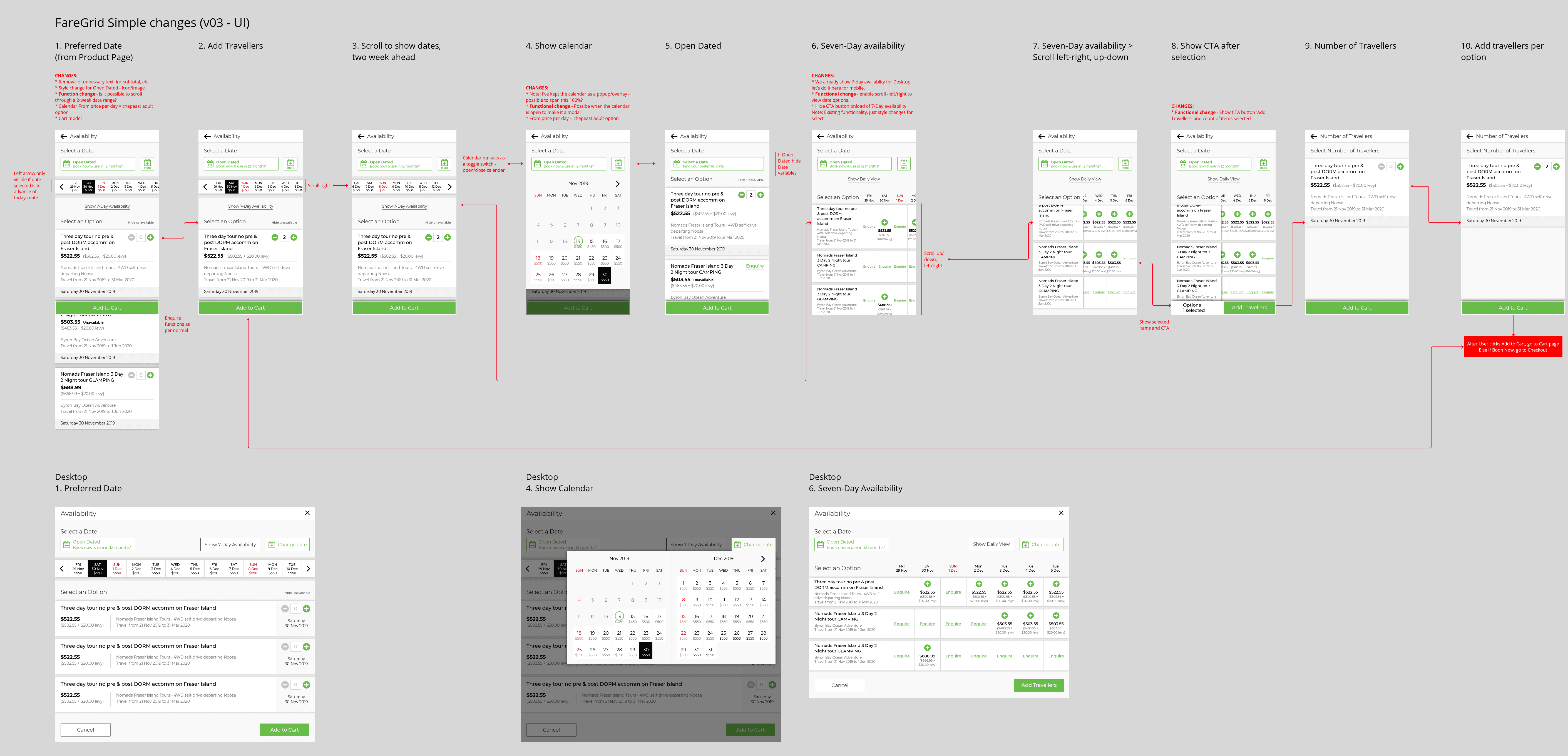
Simple Fare Grid vs Fare Grid
I designed and tested two variants against different product complexity levels:
Simple Fare Grid, a staged, list based flow: pick a date, see the relevant option, add travellers, add to cart. One decision at a time.
Fare Grid, a fuller matrix view for products where customers genuinely benefit from comparing several dates and options side by side (desktop first, flexible travellers).
I iterated through a number of versions refining scroll behaviour, the open dated toggle, seven day availability views, and, importantly, how the "Add to Cart" call to action responded once an option was actually selected, rather than sitting permanently active regardless of state.
By the later iterations, both variants had converged on the same underlying elements and only differed in how much availability was shown at once. One interaction model, not two.

Cleaning up checkout
For multi traveller bookings, I collapsed pickup and mandatory detail collection down to one instance per tour rather than one per FareType, and reworked the cart to show one clear item per booking with editable quantities, rather than a count that conflated "items" with "quantity."
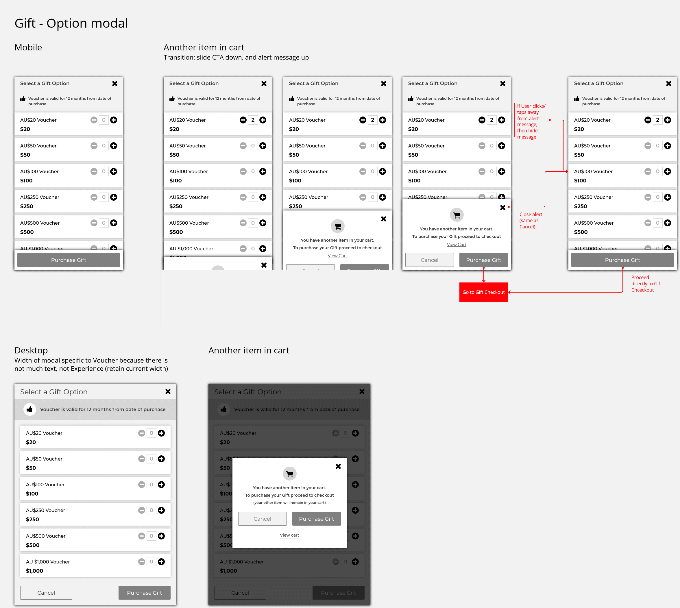
I also applied the same consistent pattern to a smaller, related flow, gift voucher purchases, to keep the interaction language the same across the site rather than introducing a fourth booking model.
Outcome
The redesign didn't just restyle an outdated grid, it resolved a structural mismatch between how the backend modelled products and how customers needed to make a decision. By the end of the project:
Every product, regardless of supplier configuration, followed the same five step decision sequence
Multi traveller bookings collapsed into a single cart item and a single set of pickup and mandatory details, instead of one per passenger type
Live and non-live (enquiry only) products were visually and functionally distinguished, rather than sharing an ambiguous "Select" button
The mobile experience no longer relied on a wide scrolling matrix to complete a booking
This work became the reference pattern for how MySites handled availability going forward, a single, defensible booking model that could flex to supplier complexity without pushing that complexity onto the customer.